|
Author
|
Topic: Artwork commission- stage by stage type tutorial too!
|
Bomu
Moderator

Member # 1

|
 posted 05-08-2002 01:00 PM
     
People have asked to see the stages of my artwork, so here we go! Started off being contacted to take on a commission. I was given a character design an basically asked to revamp him:  I said sure. Sounds like a fun challenge.. So went away, searched for ideas, any reference material I might need, and began work! It took days (not solid) of drawing and came back with this:  It was approved! But also got a little critique from elsewhere (couldn't post it here for CnC at the time), and made a few amendments. After that, I tightened up the pencil work. Sometimes this means lgihtboxing the existing sketch, but for this I went over it with a darker pencil (HB) and cleaned up the excess with erasers:  Then onto the colouring stage! First thing I do is clean up the line art- after zooming in you notice a lot of scum around the pencil work, which was unoticable on the original paper version, so I fine tune it further.
Then the flats are laid down. Im very much a perfectionist with my flats, and you have to be when flatting for pencil lineart (you can hide bad flatting behind inked work):  It's been approved for the second time so it's now up to me to progress as I see fit. I fear CGing at the start, but it all seems to come together as I get into it  Stay tuned for the next step, which will probably be the finished product!
--------------------
Organic Metal
Posts: 1622 | From: Kent, England | Registered: Jan 2002 | IP: Logged
|
|
|
|
|
|
|
|
|
|
|
|
Bomu
Moderator
Member # 1
|
posted 17-08-2002 06:37 PM
Thanks for the comments guys! Well I finally finished him a few days ago, so here's the final steps, sorry if this thread is getting a little slow to load, but I'll presume you all wanted to see the end results anyway Well, it took me several days on and off (mainly off) but I rendered this guy to a level I was satisfied with and despite several some colouring flaws it didn't turn out too bad, right?: 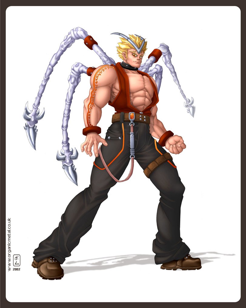 I didn't really like the look of the white tendril thingies, so I coloured 'em black and change the saturation level on everything but the orange- something I wanted to try after checking out one of Hung Tae Kim's works  Well I have two versions at least just incase client didn't like the latest version: Well I have two versions at least just incase client didn't like the latest version: 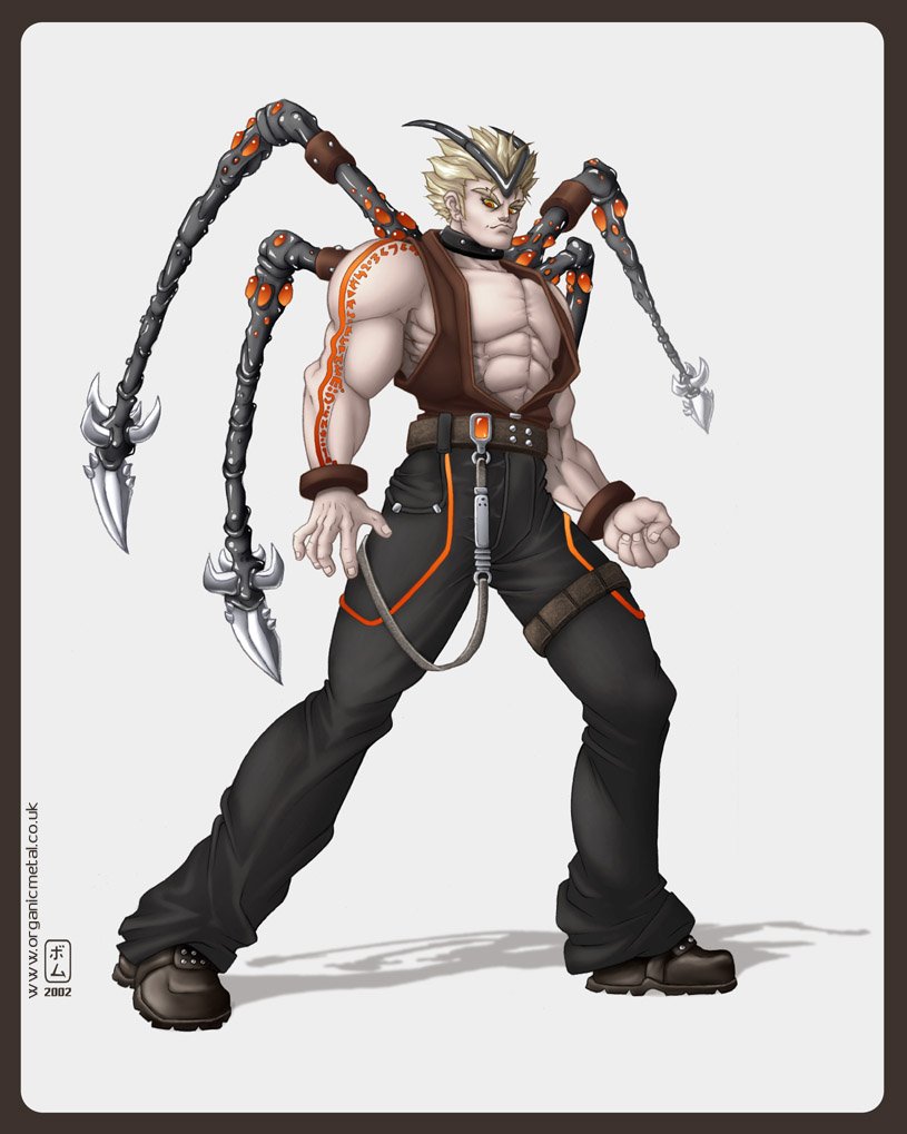 So there ya go! As far as my next artworks goes, I've got one in the works at the moment, which I'm doing for a friend as a favour.. and then I gotta do my game appology pic, even though that one'll only take 15 minutes btw, yeah, he was all done on A4 paper! (11.5x8 inch to anyone else)
--------------------
Organic Metal
Posts: 1622 | From: Kent, England | Registered: Jan 2002 | IP: Logged
|
|
|
|
|
|
|
|
|
|
|
|
|
|
|
|
|
|
|
|
|
|
Bomu
Moderator
Member # 1
|
posted 20-08-2002 07:32 PM
Thanks for the positive comments guys! Make me just wnna go awy and work on something even better and hopefully I will R_T, yeah, I think you're right. I tried to imprive the arm a bit since the first pic, but it could still do with some work. Giam, I did try rendering the eyes and putting in one of those little light shines, but it blended too much and did'nt look clear, I figured since it's not close up portrit, I would be better off leaving out too much detail.. As I say, I'll try something more adventurous next time, maybe with a male and femle chracter AND background, since I don't think I've actually ever attepted that! - should be interesting
--------------------
Organic Metal
Posts: 1622 | From: Kent, England | Registered: Jan 2002 | IP: Logged
|
|
|
|
|
|
|
|
|
|
|
|
|
|
|
|



 My Profile |
  Register |
  Search |
  FAQ |
FAQ |  Forum Home


 UBBFriend: Email this page to someone!

 posted 05-08-2002 02:05 PM


