Topic: Website Splash Page (also, my best artwork yet!!!)
Bomu
Moderator
Member # 1
posted 05-09-2002 04:46 PM
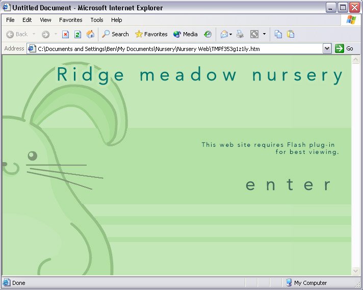
I'm working on a website for a local Nursery School and after getting half way though a simple animation or the mascot, I stopped and began working on the splash page. I'm after some C'nC before finalizing it. If you honestly think it's professional looking enough to stay, let me know and if you think there's anything I could do to make it look a lot better let me know that as well
Now now for the finally - my best artwork yet!!!:
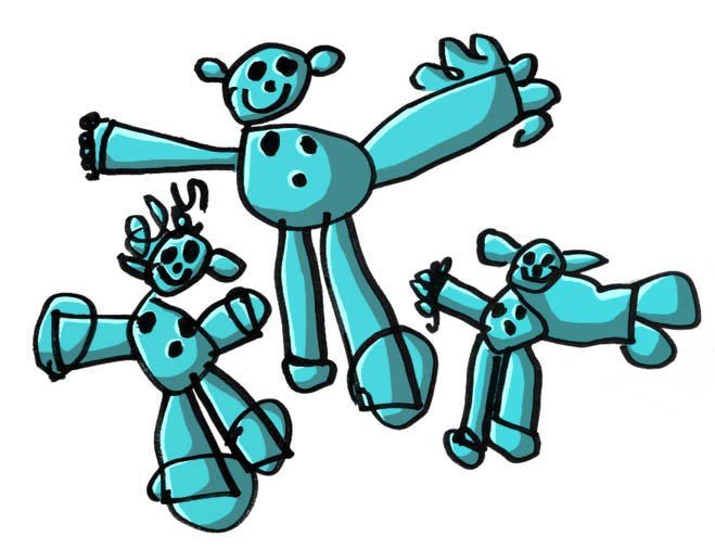
Ok, I didn't do the line art for this one- the kids from the nursey did, but I did CG it! I needs to be used somewhere in the site, but I dunno what to do with it or where to place it!
Posts: 1622 | From: Kent, England | Registered: Jan 2002 | IP: Logged
AKATT
Mega Member
Member # 38
posted 05-09-2002 10:49 PM
the splash page looks fine.
about the pic. I don't know the code but on somesites everytime you load a page a random pic is displayed in a given section. Maybe you could do that on the main page?
posted 07-09-2002 07:11 PM
aww how cute hehe they are good...nothing wrong at all and i liked how u colored the pick
Posts: 162 | From: TX | Registered: Apr 2002 | IP: Logged
Random_Task
Grand Member
Member # 30
posted 07-09-2002 11:07 PM
lmao, very cool stuff...i'd just chuck those dudes on a background and adjust the opacity a bit...
-------------------- there is no spoon
Posts: 141 | From: Australia | Registered: Feb 2002 | IP: Logged
G.i.A.m.
Moderator
Member # 14
posted 09-09-2002 08:47 PM
dont like the way the title overlays the bunny. Personaly I would use a drop shadow instead, to separate the Title from the rest.
For the cg well uhm it suits the drawing well and the light source is solid .
-------------------- Wer nicht vom Meister lernt, lernt nie etwas.
posted 10-09-2002 01:47 AM
i would put the cg in a banner...might look good as a banner and for the front page it looks ok
-------------------- if you think you will fail a battle before starting it ,then you have already lost. tuigi
Posts: 310 | From: canada | Registered: May 2002 | IP: Logged
Bomu
Moderator
Member # 1
posted 16-09-2002 02:44 AM
Cheers for the comments guys - They've been taken on board and will be acted upon shortly The site's comming along ok- I've got the static layout for most of the site sorted. The flashy bits will be the hard part since I'm still not confident with Flash. I'll let ya'all know when it's done!
In the meantime, what do you think of this for a bizzare and creative graphical piece?
Yes, I'm still looking at you Metalman I'm still trying to come up with an effective looking formula with my graphics and I'm not sure if this could be considered any good, or just plain chaotic! It was originally a site design for an organisation called the BNI, but it ended up evolving significantly and I can't see them accepting this as their website!
The bizarre piece looks good (agreed, I don't see how this could function as a website, but you'd never know ). A little chaotic, but definately not in a bad way ^^
posted 01-10-2002 02:56 PM
Defo your best art YET!LOL The splash page is real cute and the pink thing is so whats that word? Ooh I cant think dammit and I did it once in an art gallery project thing.
Posts: 134 | From: England | Registered: Feb 2002 | IP: Logged